💡 Why Control Center in iOS 10 makes sense
27 Aug 2016
6 minsI’ve been using the developer previews of iOS 10 for a few months now and I’m really pleased with it. The updated design language feels more natural, tappable and super playful compared to the stark constraint of iOS 7. The overall usability score is definitely higher.

Control Center has changed with every major iOS update since its introduction in iOS 7. In fact, even previous versions of the platform featured a proto version of Control Center at the bottom of the screen. The total number of available controls has been growing steadily, but the overall layout has stayed remarkable consistent: I’ve developed great muscle memory patterns for things like Wifi, Do not Disturb, Flashlight and Camera. Yet, I’ve stumbled across opinions that the recent Control Center redesign is more or less change for change’s sake.

Toggles
Probably everyone’s most frequently used Control Center component, the system toggles, haven’t changed too much compared to iOS 9. In their active state, however, they now feature prominent colors like orange for Airplane Mode and blue for Wifi and Bluetooth.
I find this to be a subtle, but meaningful improvement and don’t really get the argument that some of these colors don’t make sense:
- orange has been used in combination with airplane mode since iOS 4 or 5
- blue is classically used for connectivity features (also present in Settings.app)
- Do not disturb has relied on different shades of blue/purple for years
I’m not sure what Rotation Lock’s red stands for, but I’ve been at a similar place when working on complex design systems: a metaphor works so well for 90% of the component’s children but isn’t that obvious with the other 10%. Even in that case, users will start to associate the button’s red state with what it does.
In the end, users will be able to start associating the bright colors with their corresponding features and peak and check if they are on even more quickly. This pattern is similar to how red/orange/green traffic lights work.

Brightness slider
Not too many changes here. The dimmed background is gone, so all slider components in Control Center now feel more tappable even though they are not really that bigger.

AirPlay Mirroring
The total separation of AirPlay and AirPlay Mirroring is probably my favorite improvement. Previous implementations always felt awkward: pick your Apple TV from a list of devices, wait for a weird new toggle to appear in between two list items, causing the whole list to shift (this always feels unnatural) and than flip the new toggle. If you’re not among the fastest of users, your device might even stream audio for a few seconds before video kicks in.
It’s great that Apple is considering audio streaming and display mirroring as two different user stories and not subsets of the same one. Probably more people will start using AirPlay Mirroring now that it’s not hidden behind a wall of interaction (read this great article by Joulie Zhou).
The new AirPlay device icons are a breath of fresh air, but I’m not a fan of how inconsistent the device pickers for screen mirroring and audio are. Sure, the audio picker comes in with a fancy proprietary animation, causing he whole UI to shift, but why break an already sensible design system based on a standard list overlay? Coming up with a natural and fluid way for bringing in new components in existing views has always been a tough task for me, so I can see how this can get out of hand quickly.

AirDrop
So glad this doesn’t take up a full row now.

Night Shift
On the other hand, this takes up a full row now, which proves Newton’s third law to be right. Probably my biggest gripe with the new UI, but I believe we’ll see a two column layout pretty soon when a new feature needs some real estate.

Shortcuts
Part of the app shortcuts can now be removed. If you delete a stock app (for now I believe only Calculator is an option) that has a shortcut in Control Center, the shortcut will go away too. It’s an edge case as most users probably won’t remove Calculator, but there’s small room for improvement in the case where they do.
The shortcut buttons stay the same size instead of splitting the functional width of the component into three. This would provide a larger tap area and look more consistent with the rest of the interface. in fact, It’s how it would have worked naturally in Flexbox.
Multiple Panes
All media playback controls now live in a separate pane to the right. In case you have any connected home devices that work with Apple’s HomeKit, you’ll get a third pane furthest to the right.
This design got introduced at the same event where watchOS’s multi-pane Control Center got killed. It’s like both Control Centers switched screens, right? To me, this makes sense:
- iOS devices always need to provide more stats and controls than the Watch, so they need more space.
- Watch interactions should be as brief and simple as possible. I’ve been using Control Center on my Watch 2–3x more since I installed the first developer beta of watchOS 3. In the same time, swiping between panes on the iPhone doesn’t seem like a hassle.
Notification Center and Control Center now look, act and feel completely inconsistent, but consistency has not been the main theme in Apple’s recent announcements. I prefer the way Control Center doesn’t take the full width of the screen. The main purpose of this design is to communicate the existence of more panes, but it also feels much more immediate and swipable. It’s highly subjective, but I feel like my interactions are quicker and more spontaneous with the new design.
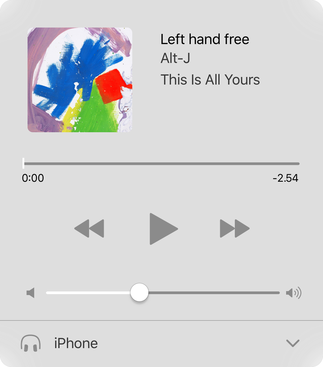
I leave Control Center in the Music pane most of the time, so I’m happy iOS maintains the position once the screen is locked. The new playback controls are a dramatic improvement. All components have so much room to breathe, everything feels tappable and, hooray, tapping on the album art or app icon takes you to its corresponding app. Unfortunately, I haven’t had a chance to test the Home pane.
What’s next?
Control Center finally feels like a thoughtful, expandable design system. I’d love to see Alex Muench’s idea for mini-icons instead of dots implemented and I can imagine we might see more Control Center panes in the future, probably for other Apple apps. I don’t think Apple would open up Control Center for App Store apps, but, who knows? Apple is currently more open to this sort of stuff than ever, so I wouldn’t deem this impossible.